Maps is rolling out a new color scheme, and now, Android Auto is getting it as well. The updated look for Google Maps replaces the usual warm colors with colder ones. Previously, parks and forests were green, but now they are mint, and roads are grey. It definitely has some usability improvements, but the change is jarring.
The new color scheme that has been rolling out for Maps on phones, tablets, and desktops can now also be seen when using Maps on Android Auto. Just like with the Maps app on Android phones, all the colors are now cooler and darker when viewing the map and using navigation in your car.
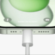
Where parks and green spaces used to show a brighter green color, they now appear as more of a minty blue-green shade. Roads that were previously a warmer grey are now a darker, colder grey color as well. Even the blue line that shows your navigation route and the info card at the top with directions have changed to match the new color scheme.
It seems like this new cooler look is trying to make Maps feel more modern. However, some people are not big fans of the change. Warmer colors generally feel more inviting while cooler shades can make maps feel gloomy or hard to read depending on lighting conditions in the car.
Only time will tell if users get used to the new colors or if Google decides to tweak them further. In the meantime, Maps users can now experience the polarizing color overhaul whether viewing on a device or using Android Auto in the car. Let me know your thoughts on whether you prefer the new colors or liked the old warmer look better!