Google is working hard to make its Gemini chatbot even better than Assistant. While there is still more to do, Gemini has already shown it can do amazing things like Gemini Live. Besides adding new things Gemini can do, Google is also improving how we use the Gemini app. It looks like they are testing a new and improved design for the app with beta users.
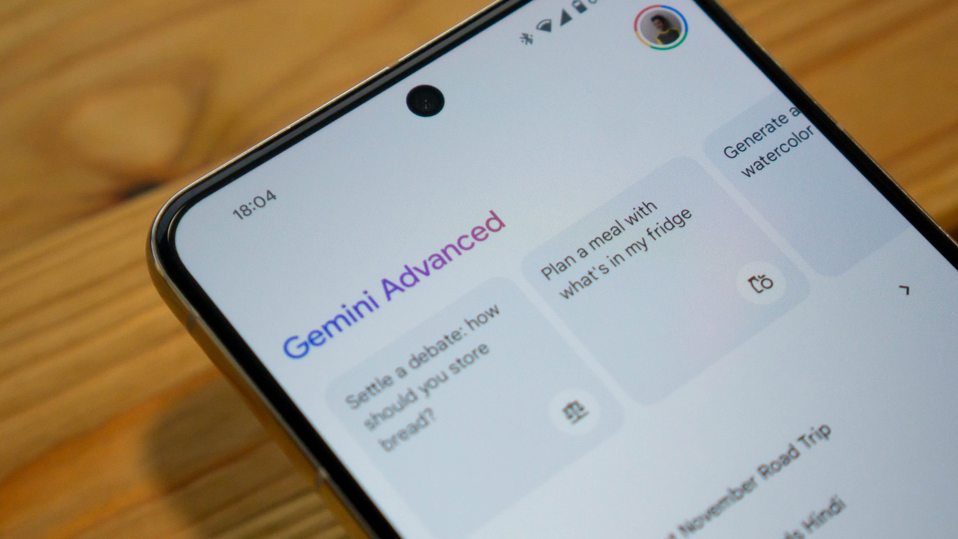
If you’re in the beta test for the Google App, you may have already seen changes to the Gemini app interface. The new design aims to make things cleaner and simpler to use. Your chat history which used to be at the top is now hidden behind an icon. This icon is in the top left corner – just tap it to see your past conversations. Below that are the customizable “Gems”, which let you talk to Gemini about specific topics.
The web version of Gemini has a similar look already. It also personally greets you by name at the start, just like on the website. We got our first peek at what this new Android design might look like about a week ago. Since access is now available for some beta testers, it seems the updated app style could reach everyone soon.
None of the changes affect how you actually use Gemini day-to-day. But the new design feels like a good improvement – Google isn’t trying as hard to promote Gemini and is focusing more on making it easy to use. The updated interface moves Gemini past the introduction phase and into a more mature stage.