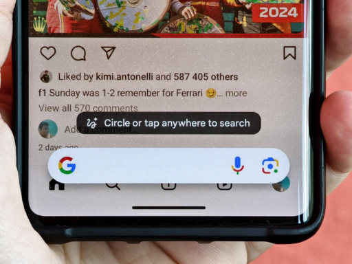
It’s not uncommon for Google to change the design of its apps. Recently, it brought back the Material 3 design to the Google app, which it had previously lost. This latest update gives the bottom bar a fresh new look.
The bottom bar lets you switch between the different sections in the Google app. Before, it only showed which tab you were on by highlighting the icon. Now it uses an interesting pill shape around the icon instead. This pill indicator makes it clear which part of the app you’re viewing.
You’ll need to use the latest test version of the Google app to see these changes. Some people call this the “beta” version. It’s number 15.40. If you don’t see the new bottom bar yet, fully closing the app might help it update.
Design changes like this don’t happen by accident. Google is always trying to improve how its apps look and work. Material 3 gives a neat modern feel. I like how the pill indicator makes navigation really straightforward.
This update isn’t the only thing Google is testing out either. They’re also trying a way for companies to get a blue tick mark next to their name in Search results. Just like the verify badges you see in Gmail.
Overall, the refreshed bottom bar with its pill indicator is a nicely polished little change. It shows Google’s ongoing efforts to refine the user experience in subtle yet effective ways. Fans of clean simple designs will appreciate this latest evolution of the Google app interface.
